Into the Spider-Verse: The Comics Craft Hidden in Every Frame
This film hides its most radical details inside its own technique. This guide explains what the animation is actually doing, using the production team’s own account.
Introduction
Most animation Easter eggs are objects placed in the background. This film’s most interesting hidden details are in the image itself: in how it is drawn, how often it changes, and what kinds of printing error it deliberately reproduces.
That makes it an unusual entry in this library. You can watch the film twenty times without noticing that two characters in the same shot are moving at different rates, or that the color layers are misaligned on purpose, and both facts are documented by the people who built it.
Alongside the technique sit the more conventional references: cameos, tributes, quotations of earlier films in the same franchise, and a piece of internet culture placed after the credits. This guide covers both kinds.
Spoiler warning
This guide discusses mid-film revelations and some plot turns. It refers to events across the film, including its final act and post-credit material. The detail-by-detail section below stays hidden until you choose to open it.
Film context
The film was produced at Sony Pictures Animation and released in December 2018, directed by Bob Persichetti, Peter Ramsey, and Rodney Rothman, with Phil Lord and Christopher Miller closely involved in its development and writing.
Its production is remembered for a deliberate rejection of the smooth, physically plausible surfaces that computer animation had spent two decades perfecting. The team set out to make images that looked printed rather than rendered, which required building new tools and, in several cases, drawing over finished computer-generated frames by hand.
That approach was labor intensive enough that the studio has described it as requiring a substantially larger art department than a comparable feature. The results were widely imitated in the following years, to the point that its innovations now read as a style rather than an experiment.
The film also carries the weight of a franchise with a long screen history, which is why so many of its references point at earlier films and at the comics that preceded them.
The details, one by one
Each entry below carries an approximate on-screen time and a label marking whether the detail has been confirmed by the people who made the film or remains an informed reading. Running times vary between theatrical cuts, home releases, and restorations, so treat every timestamp as a signpost rather than a precise measurement.
It refers to events across the film, including its final act and post-credit material. Open this section when you are ready to read the details in full.
Times refer to the theatrical version, which runs about 117 minutes.
The image reproduces the dots of cheap color printing
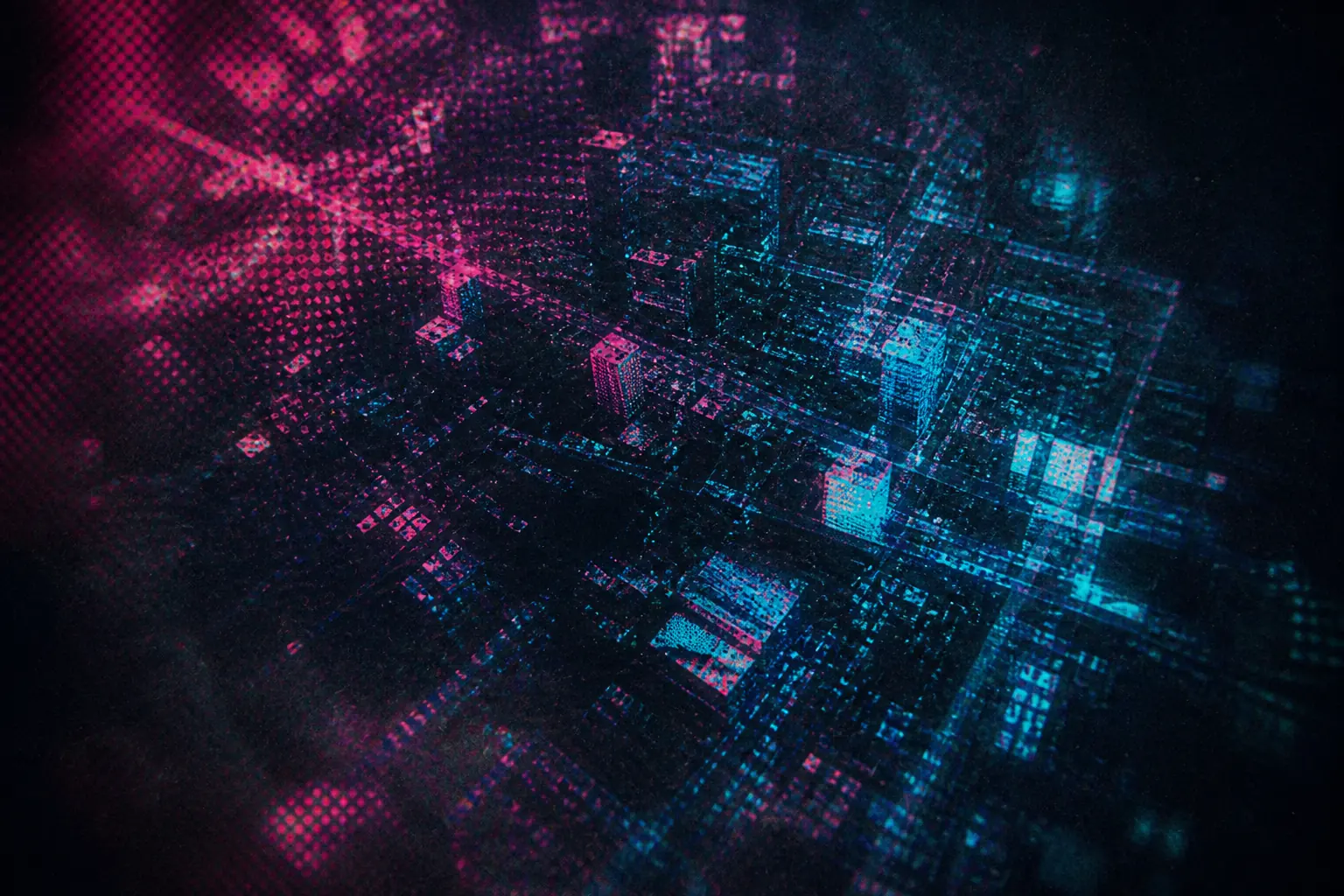
Look closely at areas of flat color and you will find patterns of small dots, the halftone screens used to reproduce color on paper. They were added deliberately, and their scale is treated as an artistic variable rather than a fixed texture.
The team has described building tools to apply these patterns in three dimensions so that they behave correctly as surfaces move and light changes, which is a genuinely difficult problem: a printed dot pattern is flat, and the film needed it to survive perspective.
The effect is what makes the film feel like a comic rather than merely reference one. It is also almost invisible on a small screen, which is one reason the film rewards a larger one.
On the record: The halftone approach is documented in interviews with the film’s animation supervisors and production designers, and in technical presentations given to the visual-effects industry.
The color layers are misaligned on purpose
At the edges of many objects, particularly in scenes of confusion or dimensional instability, the color separates into offset magenta and cyan fringes. This reproduces misregistration, the printing fault that occurs when color plates are not perfectly aligned.
The team used it as a storytelling device rather than a constant texture, increasing the offset when the protagonist is disoriented and reducing it when he is in control. It is the film’s most elegant piece of hidden information, and it operates below conscious notice.
The same effect, applied to the character who does not belong in this world, marks him as printed on the wrong plate. That is a joke about printing carried entirely by the image.
On the record: The deliberate use of misregistration and its narrative application have been described by the film’s animation and visual-effects leads in industry presentations and interviews.
Characters are animated at different rates in the same shot
Animation is conventionally produced either on ones, with a new drawing every frame, or on twos, with each drawing held for two frames. This film uses both simultaneously, animating the inexperienced protagonist on twos and more assured characters on ones.
The result is that the protagonist appears very slightly less fluid than the characters around him, and becomes smoother as the film progresses and his competence grows. The technique is a character arc expressed as a frame rate.
The team has confirmed the approach and described the difficulty of making two rates coexist without reading as an error. It is the single most cited technical detail from the production, and it is genuinely undetectable to most viewers.
On the record: The mixed-rate approach has been confirmed by the film’s animation supervisors in interviews and in technical talks, including presentations to animation industry audiences.
The film uses the printed page’s furniture as interface
Thought bubbles, caption boxes, sound-effect lettering, and multi-panel layouts appear throughout, integrated into the action rather than used as transitions. The film also opens with a mock printing-approval stamp and treats its own titles as cover text.
These are not decorative. Caption boxes deliver interior monologue that would otherwise require voice-over, and panel layouts compress simultaneous action in a way conventional editing cannot.
It is the most complete adoption of comics grammar in a mainstream animated feature, and the design team has discussed each device as a solution to a specific storytelling problem.
On the record: The comics-grammar devices are documented in the film’s published art book and in interviews with its production designers.
The Stan Lee appearance and the tribute cards
Stan Lee appears as a shopkeeper in a brief sequence, animated and voiced before his death in November 2018, weeks before the film’s release. The film subsequently carries dedication cards to both Lee and the artist Steve Ditko, who died earlier the same year.
The timing was not planned. The cameo was made as a routine tradition and became a memorial by circumstance, and the cards were added late in production.
It is worth documenting precisely because the film’s emotional weight here is partly accidental. The scene as written is a joke about a return policy.
On the record: The cameo and the dedication cards appear in the release print, and their timing relative to Lee’s and Ditko’s deaths is a matter of public record.
Two earlier screen versions are quoted directly
The film quotes earlier screen incarnations of the character openly, including a reference to a memorable moment from the 2004 sequel involving pizza delivery, and closes its post-credit sequence with a widely circulated piece of internet culture derived from a 1967 animated series.
Both are references to the franchise’s own history rather than to other films, which is a distinct category: the joke depends on the audience having watched previous versions of the same character.
The post-credit gag in particular is unusual in that it references a meme rather than a film, and the meme’s source is an animation the studio could license.
On the record: Both references are identifiable in the film, and the post-credit sequence uses licensed material from the 1967 series.
Background text and graffiti attributions
The film’s New York is dense with signage, posters, and street art, and compiled lists identify a great many of them as references to comics creators, real artists, and earlier stories. Some are genuine and acknowledged; a substantial number are not.
The production has confirmed working with street-art references and building a graphic language for the city, but not the specific attributions circulating for individual walls and signs.
The safe position is that the city is designed and dense, and that specific identifications require a source before they should be repeated.
On the record: The production has discussed its approach to the city’s graphic design; specific attributions in compiled lists generally lack confirmation.
Connections to other films
Within animation, the film’s closest relatives are earlier attempts to make computer imagery look hand-made, including the studio’s own experiments and the graphic approach of European animation of the 2000s. What distinguishes this film is that it treated printing artifacts, rather than drawing, as the thing to imitate.
Its franchise references reach back through two decades of live-action films to a 1960s television animation, which our post-credit history guide touches on from a different direction: both films are managing an audience’s memory of earlier versions.
The film’s influence has been rapid and visible. Within five years, several major animated features had adopted mixed frame rates, hand-drawn overlays, and deliberate printing artifacts, which makes the original techniques harder to see as choices.
Cultural references explained
The halftone dot pattern the film reproduces is a real artifact of mid-century comic-book production, where cheap paper and four-color printing produced visible dots and frequent misregistration. Readers of the period saw those faults as the medium; the film treats them as its signature.
The film’s Brooklyn is specific, from the graffiti to the bodega to the bilingual household, and the production consulted extensively on that texture. The protagonist’s Afro-Latino identity is central rather than incidental, and much of the design work supports it.
The music is built substantially on contemporary hip-hop rather than on an orchestral superhero idiom, which places the film in a particular moment of American popular culture and dates it deliberately.
Confirmed facts and interpretation
This is one of the best documented productions in this library on technique, because the team presented its methods to industry audiences and published an art book. Claims about the animation itself are unusually solid.
Claims about background content are the opposite. A city this densely designed invites identification, and most circulating attributions for individual signs and walls have no source behind them.
On the record
- Halftone dot patterns were applied deliberately and built to behave correctly in three dimensions.
- Color misregistration was used as a narrative device, increasing with the protagonist’s disorientation.
- Characters are animated at different frame rates in the same shot, with the protagonist becoming smoother as he gains competence.
- Comics devices including caption boxes, thought bubbles, and panel layouts are integrated into the action.
- The Stan Lee cameo was completed before his death, and dedication cards to Lee and Steve Ditko were added late.
- The post-credit sequence uses licensed material derived from a 1967 animated series.
Interpretation, not fact
- That specific background signs and murals reference particular comics creators.
- That every character’s frame rate corresponds to a fixed narrative status.
- That the film’s palette assigns specific colors to specific dimensions throughout.
Sources consulted
The material below informed this guide. Where a claim rests on a single account, the guide says so in the relevant entry.
- Spider-Man: Into the Spider-Verse: The Art of the MovieTitan Books. Production art and interviews documenting the film’s graphic approach and comics devices.
- Technical presentations by the film’s animation and visual-effects leadsSIGGRAPH, Annecy International Animation Film Festival. First-hand accounts of the halftone tooling, misregistration, and mixed frame rates.
- Interviews with the directors and animation supervisors, 2018–2019Variety, IndieWire, Cartoon Brew. Source for the production’s stated intentions and the scale of its art department.
- Film credits and licensing informationSony Pictures Animation. Confirms the licensed material used in the post-credit sequence.
- Documentation of mid-century comic-book printing processesSmithsonian Libraries, Billy Ireland Cartoon Library and Museum. Background on the halftone and misregistration artifacts the film reproduces.
Spotted an error or have a documented source we should add? Write to [email protected] and read our corrections policy.